Making gantt charts in R using `ganttrify`
I needed to make a gantt chart for a proposal submission and thought R might be easier than doing it directly in Affinity Designer. The R package ganttrify was hugely helpful and offered a detail tutorial in their README. Here’s what worked for me.
The package takes your timeline in four columns: wp (the overall categories), activity, start_date, and end_date:
gantt_table <- data.frame(
  wp = c(
    "Planning",
    "Phase 1",
    "Phase 1",
    "Phase 1",
    "Phase 2",
    "Phase 2",
    "Phase 2",
    "Phase 2",
    "Integration"
  ),
  activity = c(
    "Define project scope and gather resources",
    "Phase 1: Initial data collection",
    "Phase 1: Supplemental data collection",
    "Phase 1: Data preprocessing",
    "Phase 2: Feature development",
    "Phase 2: Performance tuning",
    "Phase 2: Evaluation and testing",
    "Phase 2: Documentation",
    "Final integration and handoff"
  ),
  start_date = as.Date(c(
    "2024-01-01",
    "2024-03-01",
    "2024-07-01",
    "2024-06-01",
    "2024-01-01",
    "2024-08-01",
    "2024-03-15",
    "2024-07-15",
    "2025-01-15"
  )),
  end_date = as.Date(c(
    "2024-05-31",
    "2024-06-30",
    "2024-12-31",
    "2024-12-31",
    "2024-06-30",
    "2025-01-15",
    "2025-01-15",
    "2025-01-15",
    "2025-06-30"
  ))
)
You then create a ganttrify object, which offers some options for customization - but further details can be adjusted in plotting. You can also turn off month numbers or month names here. For a cleaner view, you can change hide_wp to TRUE, which will remove the theme-level headers.
library(ganttrify)

p <- ganttrify(
  project = gantt_table,
  by_date = TRUE,
  hide_wp = FALSE,
  project_start_date = min(gantt_table$start_date),
  month_number_label = FALSE,  # turn off default month numbers
  month_date_label = FALSE     # turn off month names
)
We can then use ggplot syntax to add a layer to customize the axis scales. I also import lubridate which rounds the dates to the nearest month or year as requested in order to tidy up visualization. The default view is for each month, which might also be suitable.
library(ggplot2)
library(lubridate)

p + scale_x_date(
  breaks = seq(
    from = as.Date(floor_date(min(gantt_table$start_date), "year")),
    to   = as.Date(ceiling_date(max(gantt_table$end_date), "year")),
    by   = "6 months"
  ),
  labels = function(x) {
    yr = format(x, "%Y")
    mo = as.integer(format(x, "%m"))
    half = ifelse(mo <= 6, "H1", "H2")
    paste(yr, half)
  },
  position = "top"
)
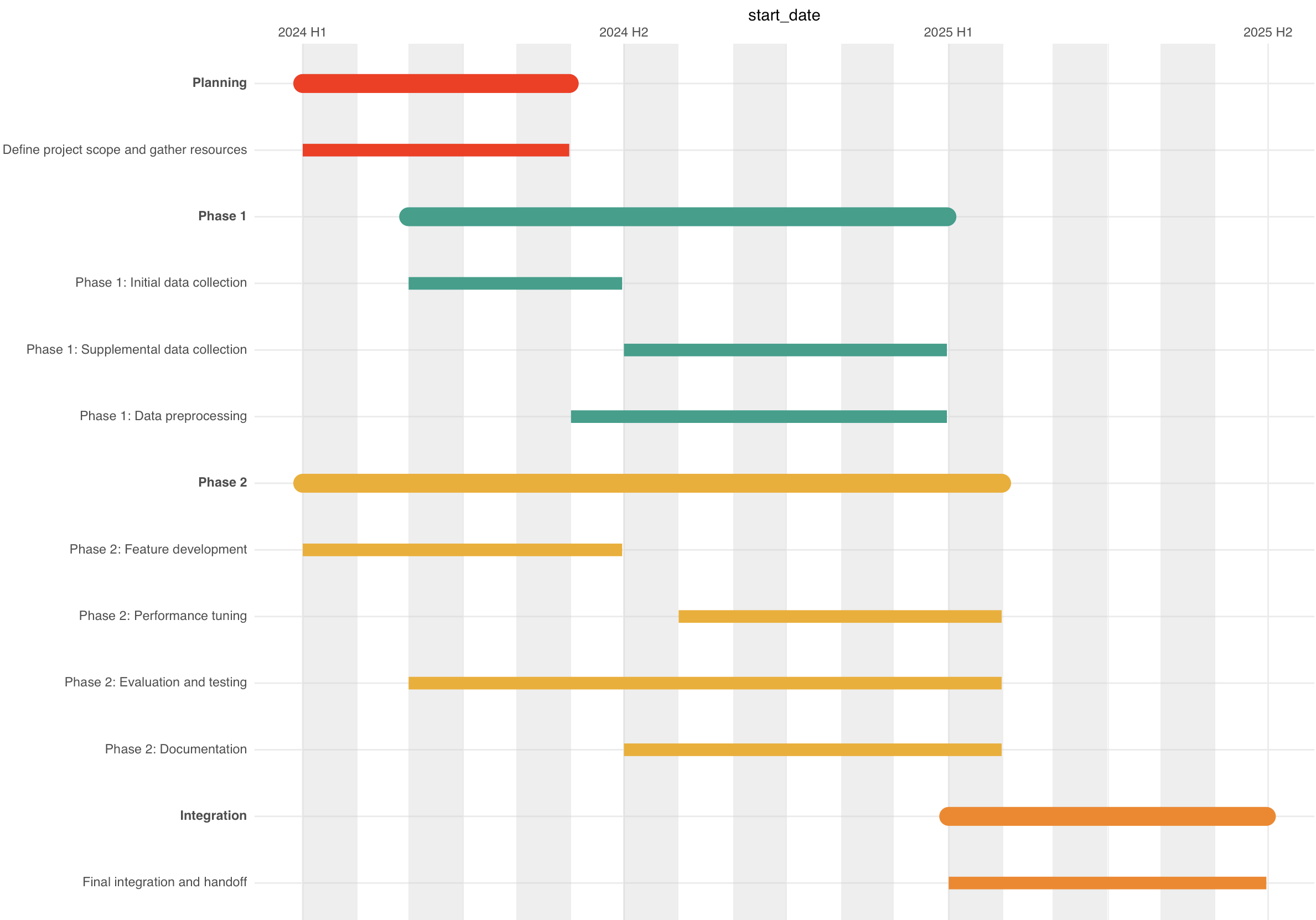
In this case I added arrows from each intermediate product to its next step (e.g., data generation 1 to data analysis 1) in Affinity Designer, but maybe with some effort it could be overlaid in ggplot2 directly. A challenge maybe for another time!